Role Product Designer
Tools Figma, Miro, Microsoft Excel
Timeline August - December (2022)
Achieving faster interactions for smoother transactions
16
Uncovered 16 usability issues during task-based usability tests. These revealed areas for improvement in navigation, copy, and the checkout page.
93%
Resolved 93% of identified issues through high-fidelity prototypes and subsequent usability tests, demonstrating a clear preference for the prototypes over the existing website.
63%
Achieved a 63% reduction in average user-reaction time following A/B testing of the current system versus high-fidelity prototypes.
DISCOVERY
Exploring the current Sukhmani Foods website
I conducted a heuristic evaluation to identify usability issues, focusing on navigation, content clarity, and design consistency. This practice allowed me to map out the existing user flow for potential enhancements.
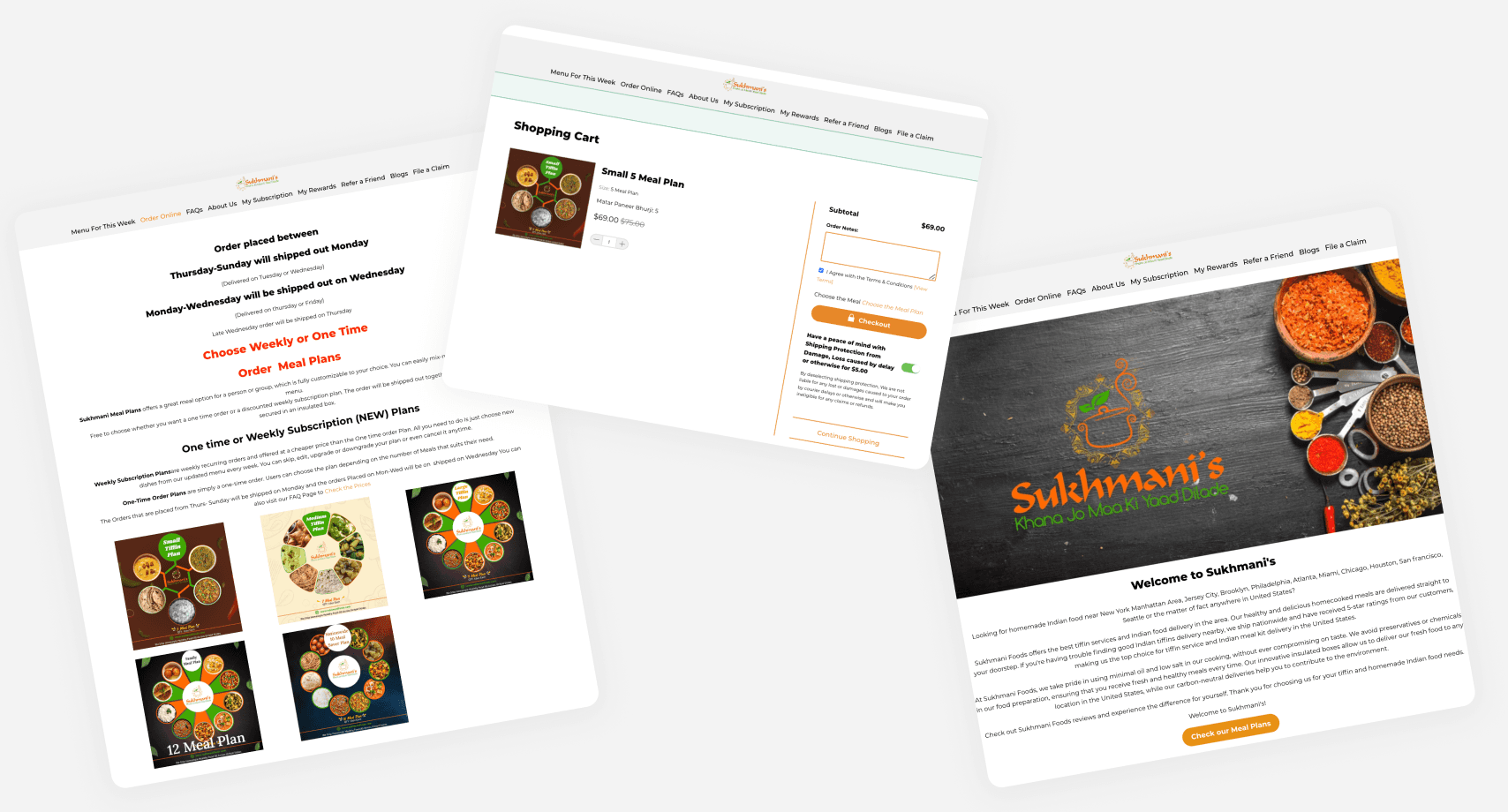
Pages have excessive text and lack clear call-to-action buttons for ordering food.
No option to edit meal plans in the shopping cart.
Limited feedback from the system when customizing meal plans.
Confusing terms, alarming tones, and inconsistent themes across pages.
Inconsistent typography, images, and colors, resulting in a weak brand identity.
Missing navigation aids like breadcrumbs or page titles.
USER SURVEYS
Finding quantitative data and metrics
To validate the critical issues found during heuristic evaluation, I conducted a user survey targeting Sukhmani Foods' primary demographic: international Indian students and working professionals aged 18-30 in the USA.
The 28 responses from the survey provided insights into user preferences and pain points, revealing that most respondents had moderate cooking skills, rating themselves at 2.5 out of 5 on average. Their main reason for buying from Sukhmani Foods was convenience.
80%
reported issues with cluttered presentation of information, including different fonts and colors
64%
expressed confusion with navigation and clickable elements
50%
felt the need for better image quality and clear menu categorization
USER INTERVIEWS
User Testing Overview
5 participants: 2 university students (1 grad, 1 undergrad), 1 software engineer, 1 tech consultant and 1 doctor
11 tasks tested
16 usability issues found

TESTING
A summary of the KPIs tested

IDEATION
Ideas and Reasoning
Mental model alignment →
Aligning Sukhmani Foods' website design with users' mental models by incorporating familiar elements from competitors' websites, as indicated by 85% of users.
Address concerns about website credibility →
Implement a comprehensive redesign to ensure adherence to specific branding, copy, and design standards, thereby eliminating the perception of being outdated and fostering user trust in Sukhmani Foods.
Make the call-to-action shine →
Highlight CTA "Order Now" on the homepage, ensuring its visibility for both returning and new users. Additionally, display bestsellers and an overview of how Sukhmani Foods operates to attract and inform new users effectively.
Declutter content presentation →
Simplifying navigation options on the homepage to prioritize essential information, such as showcasing product images and reviews, can reduce user distraction and clarify how Sukhmani Foods works.
DESIGN DECISIONS
Recommendation 1
Highlighting the ‘Order Now’ CTA and providing social proof
The best way to streamline the ordering process is to make it easily accessible.
I added an "Order Now" CTA button on the homepage, ensuring users can quickly place their orders. This enhancement is supported by social proof elements like FAQs, bestsellers, and reviews, making the site more welcoming and user-friendly.
Recommendation 2
Checkout Optimization for higher conversion rates
Made it easier for users to edit their orders before checkout and added a filter to help people with specific dietary needs.
Clear steps now guide users through the checkout process, and personalized starter boxes make the experience more convenient and satisfying.
Recommendation 3
Highlighting the ‘Order Now’ CTA and providing social proof
To build trustworthiness and create a cohesive experience during the redesign, I studied competitor user flows to understand the successful patterns they had adopted. I then applied similar flows to Sukhmani Foods, leveraging the principle of recognition over recall.
This approach helped new users feel more familiar and comfortable navigating the site.

MEASURING SUCCESS OF THE REDESIGN
User Testing Overview
To validate my prototypes, I conducted another round of usability testing sessions, assigning participants the same tasks and measuring the same KPIs as before. Here are the results:

LEARNINGS
Reflections
Navigating my first grad school project: From confusion to clarity
Starting my first HCI project in my Master's program at Arizona State University posed a different challenge without a real client. Understanding the project's true scope took time and became clearer after several user interviews and affinity mapping sessions.
Impact over Features
During the initial ideation, I set out to tackle 15 out of 16 usability issues uncovered in user research. The feedback I received was a pivotal moment, teaching me to prioritize solutions that bring real value to my hypothetical client.